In my job as a Archaeologist/GIS tech in a Cultural Resource Management firm we had to produce numerous maps for our reports. A
general project location map was always required. These simple maps always ran the spectrum from insanely detailed to vague and pointless. The goal of these maps were to show the project location, preferably with enough detail so
anyone could find the area. I've chosen two examples for my lab exercise.

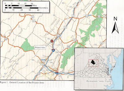
The first map would be considered a
bad example. The circle representing the project location does not provide enough detail. The map seems to be at the wrong scale, hence the circle taking up the whole page. A person unfamiliar with the area (in this case, Virginia) cannot discern,
at a glance, where the project lies within the State and/or County. The scale bar text runs outside the whiteout box. The overall map design seems to have been cobbled together rather hastily.
The second map is considered a
good example. The project location is easily discernible. A
statewide inset is shown, giving the county location. The Scale bar and North Arrow are a lot cleaner and less
busy. These maps aren't intended to win any design awards. They are meant to be simple and concise and provide anyone (even the geographically challenged ) with a quick and accurate view of the project location.

.JPG)