
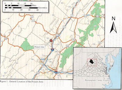
The first map would be considered a bad example. The circle representing the project location does not provide enough detail. The map seems to be at the wrong scale, hence the circle taking up the whole page. A person unfamiliar with the area (in this case, Virginia) cannot discern, at a glance, where the project lies within the State and/or County. The scale bar text runs outside the whiteout box. The overall map design seems to have been cobbled together rather hastily.
 The second map is considered a good example. The project location is easily discernible. A statewide inset is shown, giving the county location. The Scale bar and North Arrow are a lot cleaner and less busy.
 .JPG)
Very nice examples...since you already are familiar with good vs bad design I am looking forward to seeing some of your work! Trisha
ReplyDelete