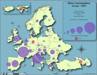
Wine data was obtained from www.wineinstitute.org. I used Mathmatical scaling to calculate my symbol size (in Excel) from the total consumption values and then used this data to obtain 5 proportional legend classes. Symbols are at 75% opacity. The legend is linear with a horizontal orientation.
The overall map layout was done in Adobe Illustrator. The basemap, scale, labels and north arrow were exported from Arcmap.
I used the NGS Winkel Tripel projection. I feel it provides an aesthetic layout of the countries.
Okay, the only thing I can see is that in a few countries the circle obscure some of the text..I know picky! I like that you put the two countries in the inset...nice!
ReplyDelete