Monday, August 3, 2009

Wednesday, July 22, 2009

Supervised Image Classification


The top image has been reclassified (supervised)by manually selecting pixels that represent certain features. A few selections were made per feature type (water, residential, agricultural etc...) Common feature classes were then recoded to combine them into more general groups. These groups were then color coded to match their feature type (i.e. water=blue etc....).
I thought the procedure went smooth, however, the results were rather confusing. There seems to be a problem with my classifying of grass and residential areas. The problem may be the Region Growing Properties, specifically the Spectral Euclidean Distance. I am still a bit confused about this function.

Unsupervised Image Classification


The top image is the reclassified (unsupervised) image. The bottom image is the original. The image was reclassified into 15 classes. These classes were then recoded into similar and more general class types (i.e. all water, agriculture etc......). Appropriate colors were then assigned to each land use type.
I encountered issues post reclassification with some land class distinctions....mainly cleared land, and crop land. These issues could have been addressed, but were beyond the scope of this lab.

Monday, July 20, 2009

Image to Map Rectification

By linking an Orthophoto to its corresponding Map image (Image to Map Rectification), cultural features can now be used in a thematic context (related to other data in a GIS). These cultural features now have actual map coordinates, rather than pixel x, y locations, resulting in accurate distance and bearing calculations.
Errors can occur with the GCP method of rectification. An image may lack any discernible features to use as control points. User error in the placement of GCP's (misinterpretation of features). The Orthophoto is distorted beyond the point of rectifying.

Thursday, July 16, 2009

Friday, July 10, 2009

Thermal Infrared Remote Sensing


Provide a brief description of why the following features appear as they do in this thermal infrared image:
Roads: Roads appear lighter due to their radiant temperatures and heat capacity. Road material absorbs more heat and remains warm through the night.
Natural and man-made vegetation: Vegetation appearance will differ depending on cover ( i.e. grass vs. sand) and moisture content of the soil (i.e. watering differences among neighbors and watering amounts in the front yard vs. backyard). The shade differences in the image could be a combination of both.
Sidewalks and Patios: The heating effects of patios and sidewalks should be similar to roads. Variations will be caused by surface types and materials.
Storage sheds in backyards: Sheds appear dark because of their low radiant temperatures. They lack an active or reflective heat source.
Automobiles: Cars will resemble sheds, except if the engine is running (or had been running prior to the image). Unlike sheds, cars do have a a heat source. The heat emitted from the engine will appear lighter.
Bright spots on many of the roofs: Vents on the rooftops will appear lighter than the surrounding roof, due to their higher radiant temperatures. This could be caused by their reflective material, but more likely, their heat source.

Sunday, July 5, 2009

Thursday, July 2, 2009

Module 2 Lab -Spot Panchromatic & SPOT Multispectral


Compare the SPOT panchromatic image and the multispectral mode display. Note any difference?
The two obvious differences are the color and resolution. The Pan image is a single band image (band 1) and the Multispectral image, like the name suggests, incorporates three spectral bands (bands 4,3,2). The Panchromatic image is at 10 meter ground resolution and the Multispectral image has a resolution of 20 meters. The displays also differ in their pixels per line values. Spot Panchromatic has 6,000 pixels per line and the Multispectral has 3000. The Panchromatic displays higher resolution and pixels per line producing a sharper image.


Saturday, June 27, 2009

CIR photography


What problems might you infer or identify in using this type of photography?

A major problem with CIR photography would be misinterpretation of objects or features. CIR photography requires a bit more color and feature interpretation training (vs.Natural). CIR 's uses in distinguishing vegetation types and vegetation health are fantastic, however, distinguishing among these vegetation types requires a trained eye. CIR is great at highlighting the contrasts between natural and unnatural (man-made) features. One might easily identify a common feature (i.e. golf course, baseball field) in the CIR image, but, be unable to interpret the color value (i.e. red vs. green).

Wednesday, June 24, 2009

Tuesday, June 2, 2009

Friday, May 1, 2009

Wind Farm Lab


I chose Huron County, Michigan for my possible Wind farm location based on the BERR planning criteria.

NREL Resource potential - OUTSTANDING wind power classification - 8.0 - 8.8 m/s or 16.8 - 17.4 mph

Ornithology - Near Dabbling Duck fall migration route. On site monitoring should be conducted to further evaluate potential impacts.

Noise and Shadow Flicker - Isolated rural location - 10+/- miles from any significant population

Shipping - Does not interfere with any U.S. or Canadian shipping lanes

Landscape/Visual impact - none

Thursday, April 23, 2009

Isohyet Lab


Isohyet map w/ 5 inch contour intervals & continuous-tone shading

Thursday, April 16, 2009

Friday, April 10, 2009

Saturday, April 4, 2009

Dot Distribution Map


WOW.......that took forever.......!!!!

Saturday, March 28, 2009

Proportional Symbol Map


Wine data was obtained from www.wineinstitute.org. I used Mathmatical scaling to calculate my symbol size (in Excel) from the total consumption values and then used this data to obtain 5 proportional legend classes. Symbols are at 75% opacity. The legend is linear with a horizontal orientation.
The overall map layout was done in Adobe Illustrator. The basemap, scale, labels and north arrow were exported from Arcmap.
I used the NGS Winkel Tripel projection. I feel it provides an aesthetic layout of the countries.

Tuesday, March 17, 2009

Choropleth Map


Choropleth map (classed), gray scale color scheme (RGB values) obtained from ColorBrewer

Equal interval class breaks were used. I'm not sure this was the best class given the data was heavily skewed to the left with one large outlier to the far right. A a result, a class field was left empty (fourth legend value).

Choropleth Map


Choropleth map
Unipolar, classed data, State level
Sequential color scheme
horizontal scale design based on limited space

Tuesday, March 3, 2009

Monday, March 2, 2009

Thursday, February 19, 2009

Tuesday, January 20, 2009

Mental Map


As you can see I'm an East Coast guy. I could be persuaded to go west just for the amazing natural beauty. I was born and raised in Texas (Carswell AFB!!! Fort Worth, Once a great SAC Base, now I'm not sure). California is beautiful, but, to far and too many natural disasters.

Tuesday, January 13, 2009

Map Critique Lab

In my job as a Archaeologist/GIS tech in a Cultural Resource Management firm we had to produce numerous maps for our reports. A general project location map was always required. These simple maps always ran the spectrum from insanely detailed to vague and pointless. The goal of these maps were to show the project location, preferably with enough detail so anyone could find the area. I've chosen two examples for my lab exercise.


The first map would be considered a bad example. The circle representing the project location does not provide enough detail. The map seems to be at the wrong scale, hence the circle taking up the whole page. A person unfamiliar with the area (in this case, Virginia) cannot discern, at a glance, where the project lies within the State and/or County. The scale bar text runs outside the whiteout box. The overall map design seems to have been cobbled together rather hastily.


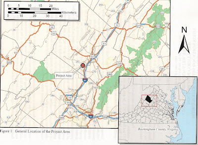
The second map is considered a good example. The project location is easily discernible. A statewide inset is shown, giving the county location. The Scale bar and North Arrow are a lot cleaner and less busy.
These maps aren't intended to win any design awards. They are meant to be simple and concise and provide anyone (even the geographically challenged ) with a quick and accurate view of the project location.

test

test post